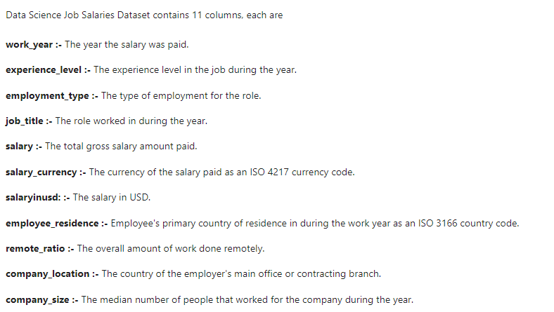
Here We will do Exploratory Data Analysis on a date from Kaggle Data Science Salaries 2023.
About Dataset
Importing the required Libraries
#Import the required libraries

import numpy as np
import pandas as pd
import matplotlib.pyplot as plt
import seaborn as sns
Dataset Loading
#load the dataset
ds_salaries = pd.read_csv('ds_salaries.csv')
ds_salaries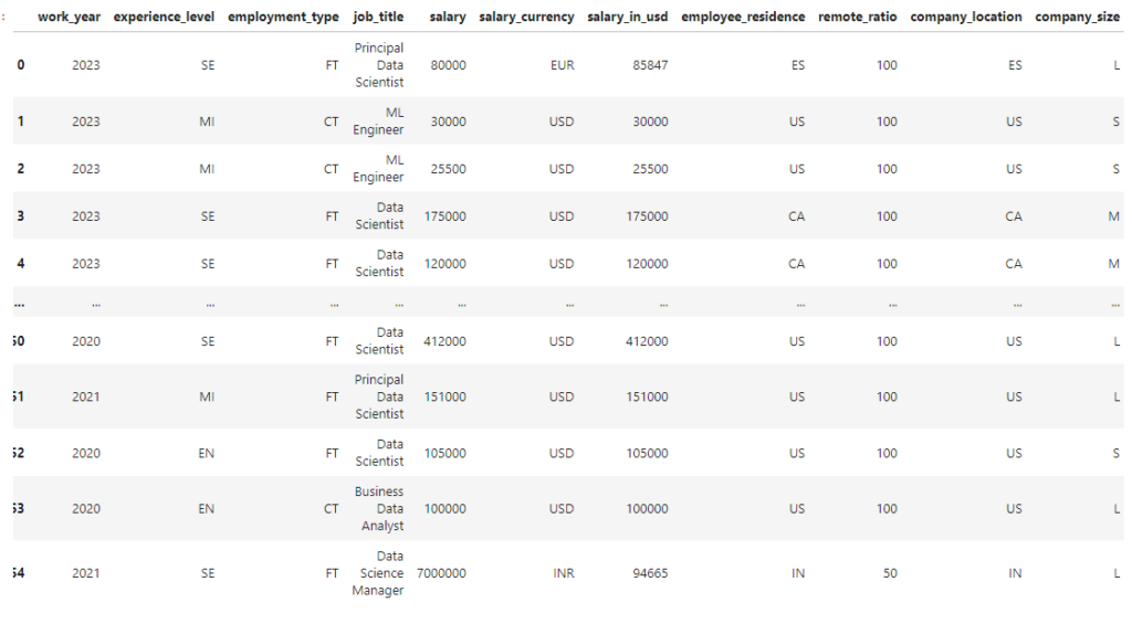
Data Exploration and Cleaning Process
Here we are going to perform data exploration and cleaning process that is the basic thing before doing EDA. We will check any null values in dataset and how many duplicated entries.
ds_salaries.head()
ds_salaries.columns
What are the data types of a dataset Data Science Salaries
ds_salaries.info()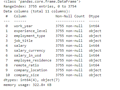
Before performing Analysis on Data Science Salaries 2023 dataset, we will check the every integer variables description like count, mean, min, max, 25th percentile, 50th percentile and 75th percentile.
ds_salaries.describe()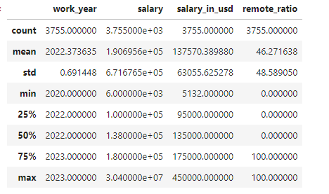
Check the null values
ds_salaries.isnull().sum()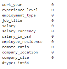
No null values are present in the dataset.
How many unique entries in the dataset?
ds_salaries.nunique()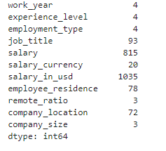
Exploratory Data Analysis
Now it’s time to perform Exploratory Data Analysis on given dataset. I explained about EDA on my blog if someone does not have clear idea of EDA, he/she can read my article Data Analysis EDA.
Univariate Analysis
Here we will analyze the dataset by considering only one variable at a time.
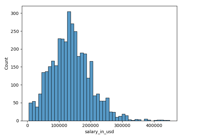
# Histograms
sns.histplot(data = ds_salaries, x = ds_salaries['salary_in_usd'])
plt.suptitle('Distribution of salary_in_usd', fontsize=20)
plt.show()
Analyze Distribution of Categorical Variables of Data Science Salaries 2023 dataset.
# Set up the matplotlib figure
plt.figure(figsize=(14, 10))

# Plot count plots for categorical columns
ct_columns = [ 'experience_level', 'employment_type', 'company_size','work_year']

for i, column in enumerate(ct_columns, 1):
    plt.subplot(2, 2, i)
    sns.countplot(x=ds_salaries[column], hue=ds_salaries[column], palette='Set2', legend=False)
    plt.title(f'Distribution of {column}')
    plt.xlabel(column)
    plt.ylabel('Count')

plt.tight_layout()
plt.show()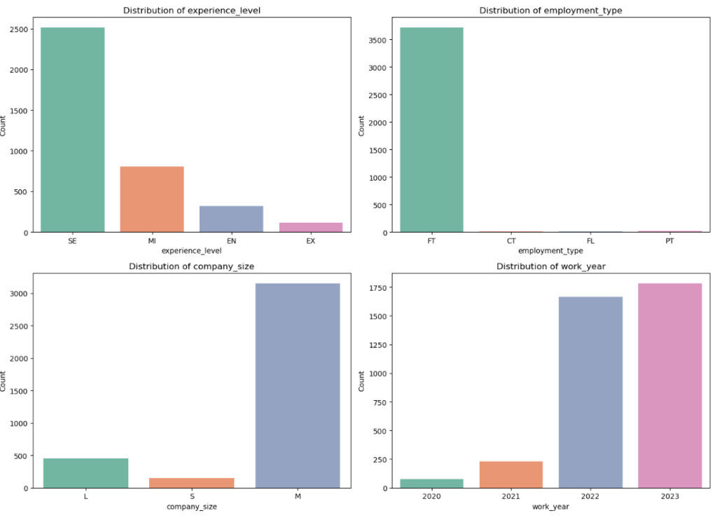
Which nation is the majority of the workforce from?
# Count the number of employees from each country
country_counts = ds_salaries['employee_residence'].value_counts()

# Find the country with the highest number of employees
most_common_country = country_counts.idxmax()
most_common_country_count = country_counts.max()

print(f"The country with the most employees is {most_common_country} with {most_common_country_count} employees.")
The country with the most employees is US with 3004 employees.
Bivariate Analysis of Data Science Salaries 2023
It is performed with the help of two variables.
# Bar Plots
plt.figure(figsize=(12, 6))
sns.countplot(data=ds_salaries, x='experience_level', hue='employment_type')
plt.title('Experience Level by Employment Type')
plt.show()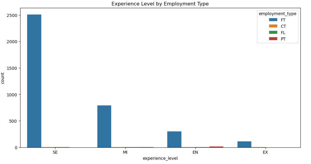
Company Size by Remote Ratio
plt.figure(figsize=(12, 6))
sns.countplot(data=ds_salaries, x='company_size', hue='remote_ratio')
plt.title('Company Size by Remote Ratio')
plt.show()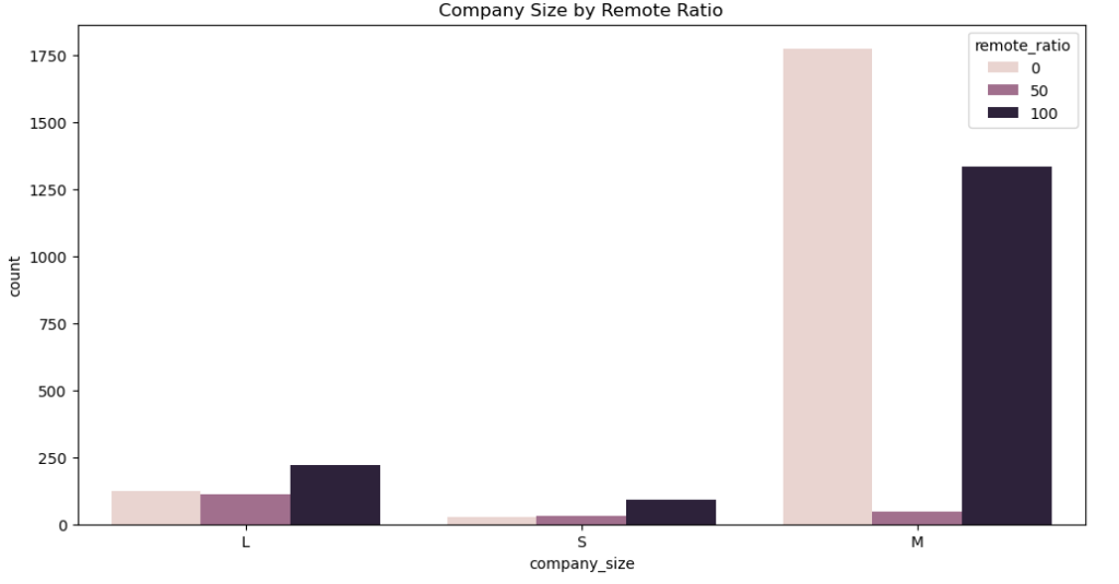
Which position pays the most money in US dollars?
# Group by job title and find the maximum salary in USD for each job title
max_salary_by_job = ds_salaries.groupby('job_title')['salary_in_usd'].max().reset_index()

# Find the job title with the highest salary
highest_salary_job = max_salary_by_job[max_salary_by_job['salary_in_usd'] == max_salary_by_job['salary_in_usd'].max()]

print(highest_salary_job)
The highest salary paid to Research Scientist job.
Multivariate Analysis
It is performed by considering more that two variables.
# Select relevant columns for pair plot
pairplot_columns = ['salary_in_usd', 'remote_ratio', 'experience_level']

# Create pair plot
sns.pairplot(ds_salaries[pairplot_columns], hue='experience_level')
plt.suptitle('Pair Plot of Selected Variables', y=1.02)
plt.show()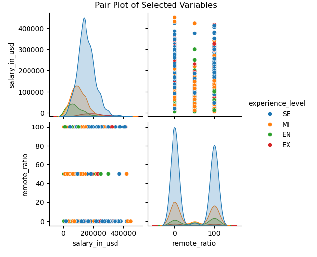
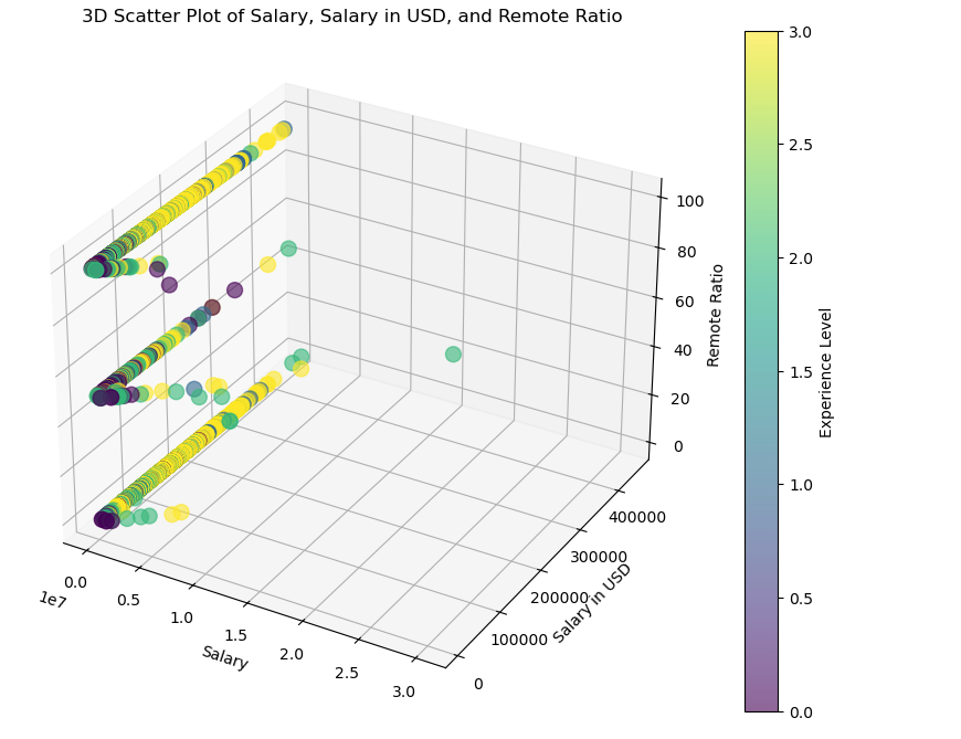
from mpl_toolkits.mplot3d import Axes3D

# Create 3D scatter plot
fig = plt.figure(figsize=(12, 8))
ax = fig.add_subplot(111, projection='3d')

sc = ax.scatter(ds_salaries['salary'], ds_salaries['salary_in_usd'], ds_salaries['remote_ratio'], c=ds_salaries['experience_level'].astype('category').cat.codes, cmap='viridis', alpha=0.6, s=100)
ax.set_xlabel('Salary')
ax.set_ylabel('Salary in USD')
ax.set_zlabel('Remote Ratio')
plt.title('3D Scatter Plot of Salary, Salary in USD, and Remote Ratio')

# Create color bar
cbar = plt.colorbar(sc)
cbar.set_label('Experience Level')
plt.show()