Welcome to the Exploratory Data Analysis using Python project series. We will perform Exploratory Data Analysis for Customer Segmentation Data for Marketing Analysis from Kaggle website.
About the Dataset

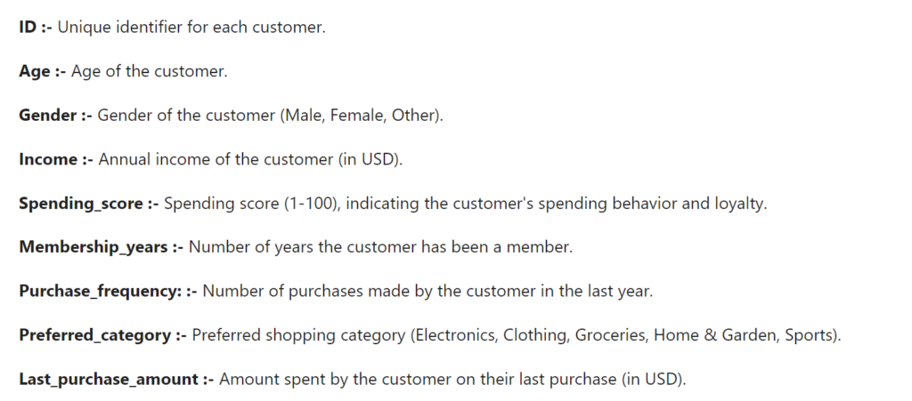
Dataset Variables information
Importing Libraries
import numpy as np
import pandas as pd
import matplotlib.pyplot as plt
import seaborn as sns
Numpy and Pandas have been utilized for numerical computations and data manipulation.
For data processing and numerical calculations, Numpy and Pandas have been used.
Load the Customer Segmentation Dataset
df_cs = pd.read_csv('customer_segmentation_data.csv')

df_cs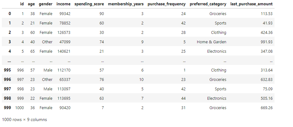
So, We have 9 Columns and 1000 rows
Data Exploring and Cleaning
df_cs.head()
df_cs.columns
df_cs.info()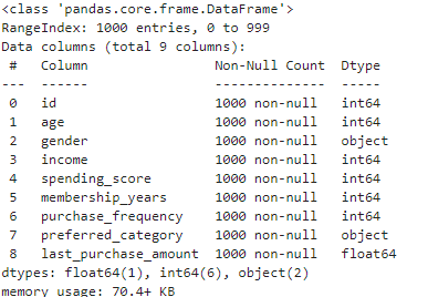
df_cs.info() shows the columns data type of dataset and memory usage
We can now identify the bits to store these values by understanding the range of values.
The values that int8 variables can store are between -128 and 127.
The values that int16 variables can store range from -32,768 to 32,767.
The values of int32 variables span from -2,147,483,648 to 2,147,483,647.
Values between -9,223,372,036,854,775,808 and 9,223,372,036,854,775,807 can be stored in int64 variables.
Because it falls within the value range, the Int32 is the ideal choice. Although Int64 can still be used, it is not recommended as it consumes more memory and reduces the efficiency of our DataFrame.
It’s a little different for floats, as it significantly impacts the number of decimal places our data can store. Four decimal digits are stored by Float16, eight by Float32, and sixteen by Float64. Since we don’t actually need to use many decimal places in our DataFrame and still want to preserve the original values, using Float16 is the best option.
Changing the data types
convert_disc = {'id' : 'int32', 'age' : 'int32', 'gender' : 'category', 'income' : 'int64',
                'spending_score' : 'int16', 'membership_years' : 'int16',  'purchase_frequency' : 'int16', 'preferred_category' : 'string', }

df_cs = df_cs.astype(convert_disc)
df_cs.info()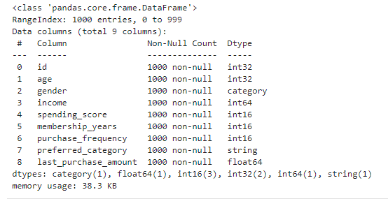
df_cs.describe()
The data is briefly and simply described in the information. include the following: range, lowest value, maximum value, count, mean, standard deviation, median, mode, and so on. A high-level understanding of the distribution of the data, including whether it is regularly distributed or skewed left or right, and whether there are any outliers in the data may be gained from the statistics summary.
df_cs.isnull().sum()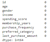
df_cs.duplicated().sum()There is no duplicate value in dataset
df_cs.nunique()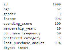
EDA techniques for Customer Segmentation
If you want to learn more about what is Exploratory Data Analysis, you can follow my details article on EDA.
Univariate Analysis
First we will show distribution of numerical features or columns of our dataset.
numerical_features_of_data = ['age', 'income', 'spending_score', 'membership_years', 'purchase_frequency', 'last_purchase_amount']

for feature in numerical_features_of_data:
    plt.figure(figsize=(8, 4))
    sns.histplot(df_cs[feature], kde=True)
    plt.title(f'Distribution of {feature.capitalize()}')
    plt.xlabel(feature.capitalize())
    plt.ylabel('Frequency')
    plt.show()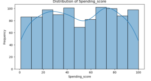
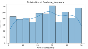
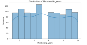
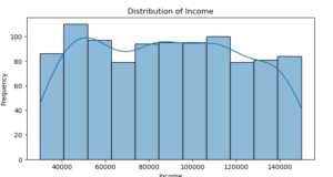
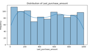
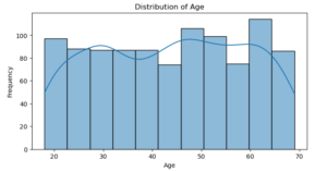
Age : The graph shows that the distribution is rather uniform, which suggests that the customers’ ages range widely.
Income : Customers in lower income ranges are more prevalent in the distribution, which is right-skewed.
Spending Score : There is a higher frequency of customers in the lower income ranges, indicating a right-skewed distribution.
Membership Years : There is a leftward bias in the distribution, with many customers having fewer years as members.
Purchase Frequency : The right-skewed distribution suggests that the majority of customers make fewer purchases.
Last Purchase Amount: A right-skewed distribution is observed, wherein the majority of customers make smaller purchases.
# Set up the matplotlib figure
plt.figure(figsize=(15, 6))

# Plot count plots for categorical columns
categorical_columns = ['gender', 'preferred_category']

for i, column in enumerate(categorical_columns, 1):
    plt.subplot(1, 2, i)
    sns.countplot(x=df_cs[column], hue=df_cs[column], palette='Set2', legend=False)
    plt.title(f'Distribution of {column}')
    plt.xlabel(column)
    plt.ylabel('Count')

plt.tight_layout()
plt.show()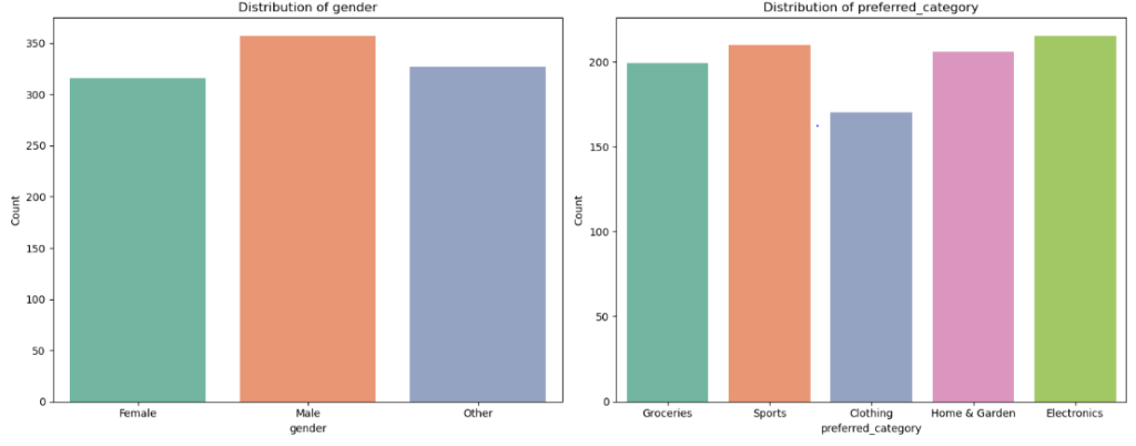
Gender : Majority of Customers are male.
Preferred Category : Sports and electronics make up the majority of product categories.
Bivariate Analysis
Here we will consider two variables for our exploratory data analysis on customer segmentation dataset.
Age vs. Spending Score
plt.figure(figsize=(8, 6))
sns.scatterplot(x='age', y='spending_score', data=df_cs, hue='gender')
plt.title('Age vs. Spending Score')
plt.xlabel('Age')
plt.ylabel('Spending Score')
plt.show()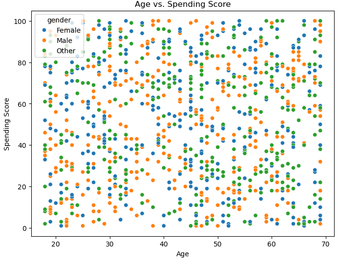
Average spending score by preferred category
plt.figure(figsize=(10, 6))
sns.barplot(x='preferred_category', y='spending_score', data=df_cs)
plt.title('Average Spending Score by Preferred Category')
plt.xlabel('Preferred Category')
plt.ylabel('Average Spending Score')
plt.xticks(rotation=45)
plt.show()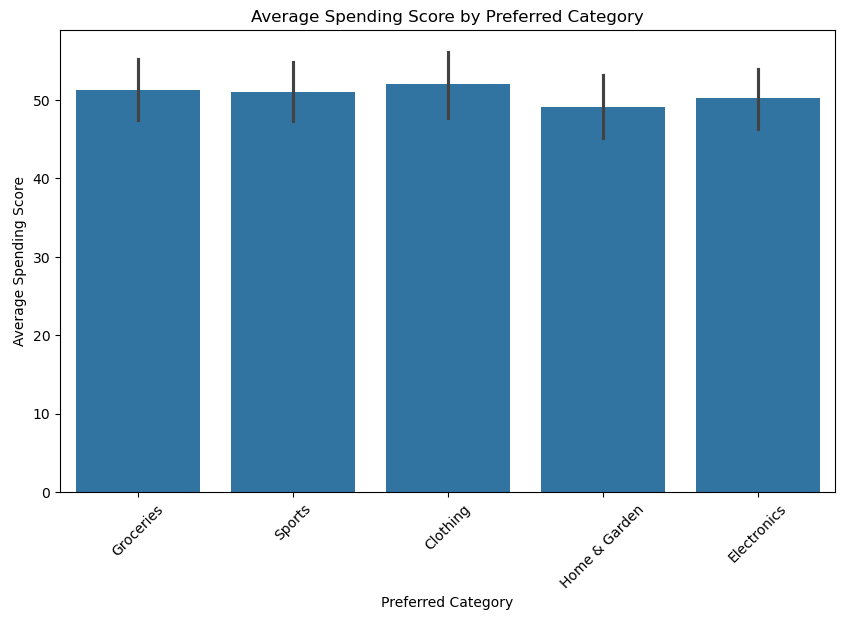
The graph above shows us that average spending scores are greater in other categories, such as Clothing.
Income vs. Gender
plt.figure(figsize=(10, 6))
sns.boxplot(x='gender', y='income', data=df_cs)
plt.title('Income Distribution by Gender')
plt.xlabel('Gender')
plt.ylabel('Income')
plt.show()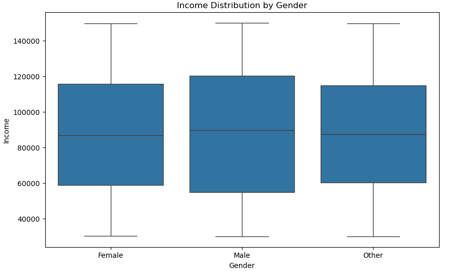
The income distribution and central tendency for each gender are shown in the box plot. It illustrates how income is allocated within each gender category and aids in identifying any gender-based income discrepancies.
Last Purchase amount by age group
# Create age groups
df_cs['age_group'] = pd.cut(df_cs['age'], bins=[0, 20, 30, 40, 50, 60, 100], labels=['0-20', '21-30', '31-40', '41-50', '51-60', '60+'])

# Box plot of last purchase amount by age group
plt.figure(figsize=(10, 6))
sns.boxplot(x='age_group', y='last_purchase_amount', data=df_cs)
plt.title('Last Purchase Amount by Age Group')
plt.xlabel('Age Group')
plt.ylabel('Last Purchase Amount')
plt.show()![Last Purchase amount by age group # Create age groups df_cs['age_group'] = pd.cut(df_cs['age'], bins=[0, 20, 30, 40, 50, 60, 100], labels=['0-20', '21-30', '31-40', '41-50', '51-60', '60+']) # Box plot of last purchase amount by age group plt.figure(figsize=(10, 6)) sns.boxplot(x='age_group', y='last_purchase_amount', data=df_cs) plt.title('Last Purchase Amount by Age Group') plt.xlabel('Age Group') plt.ylabel('Last Purchase Amount') plt.show() Last Purchase amount by age group # Create age groups df_cs['age_group'] = pd.cut(df_cs['age'], bins=[0, 20, 30, 40, 50, 60, 100], labels=['0-20', '21-30', '31-40', '41-50', '51-60', '60+']) # Box plot of last purchase amount by age group plt.figure(figsize=(10, 6)) sns.boxplot(x='age_group', y='last_purchase_amount', data=df_cs) plt.title('Last Purchase Amount by Age Group') plt.xlabel('Age Group') plt.ylabel('Last Purchase Amount') plt.show()](https://learnaiwithali.com/wp-content/uploads/2024/09/lst.png)
We may better identify customer segmentation and customize marketing strategies by examining this box plot analysis to learn how Last Purchase Amount differs across age segments.
Average purchase frequency by gender
plt.figure(figsize=(10, 6))
sns.barplot(x='gender', y='purchase_frequency', data=df_cs, errorbar=None)
plt.title('Average Purchase Frequency by Gender')
plt.xlabel('Gender')
plt.ylabel('Average Purchase Frequency')
plt.show()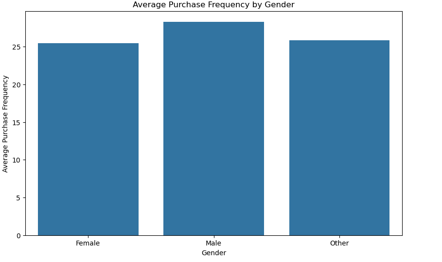
Multivariate Analysis of Customer Segmentation
# Checking if 'gender' column is in the DataFrame
if 'gender' in df_cs.columns:
    sns.pairplot(df_cs[['age', 'income', 'spending_score', 'membership_years', 'purchase_frequency', 'gender']], hue='gender')
    plt.suptitle('Multivariate Analysis: Pair Plot', y=1.02)
    plt.show()
else:
    print("The column 'gender' is not present in the DataFrame.")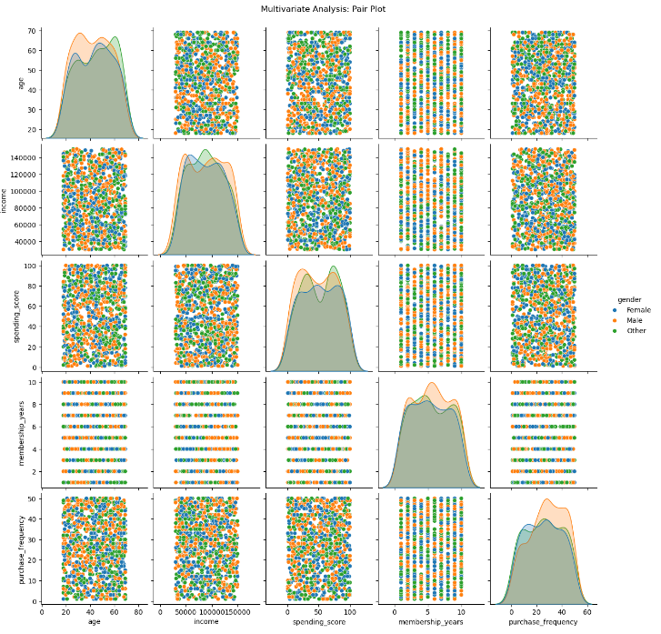
Visualizing the Heatmap graph Exploratory Data Analysis for customer segmentation
# Select only numeric columns
numeric_df_cs = df_cs.select_dtypes(include=['number'])

# Plot the heatmap
plt.figure(figsize=(12, 6))
sns.heatmap(numeric_df_cs.corr(), annot=True, cmap='coolwarm', linewidths=0.5)
plt.title('Multivariate Analysis: Correlation Matrix')
plt.show()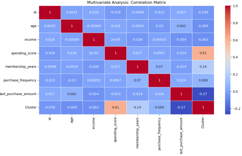
plt.figure(figsize=(12, 6))
sns.scatterplot(data=df_cs, x='income', y='spending_score', hue='preferred_category', size='membership_years', sizes=(20, 200), alpha=0.7)
plt.title('Multivariate Analysis: Income vs. Spending Score by Preferred Category and Membership Years')
plt.show()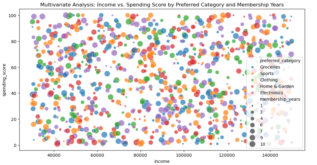
Uses membership years as the bubble size and preferred category as the hue to represent the relationship between expenditure score and income.